

My Final UX/UI Ironhack Bootcamp Project
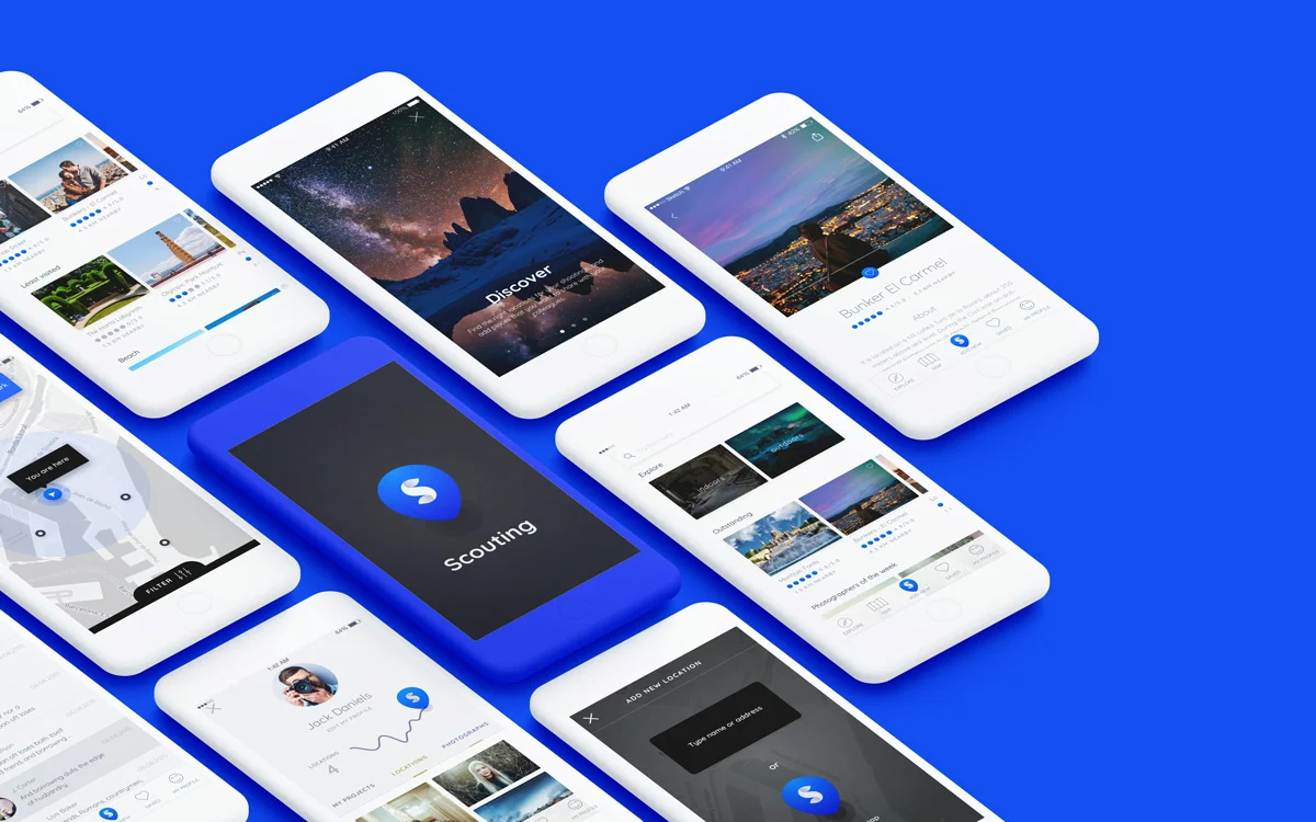
Scouting is an app for photographers to serve as a location finder for work or explore, they will find in this app as much information as possible about each place, and they will be able to add as many locations as they discover.
Why?
In the last years photography has became one of the most important tools as an expression, as an art, as a communication tool for humans, and i find photography fascinating, so i thought about designing an app to make their work easier.
“My hope is that we continue to nurture the places that we love, but that we also look outside our immediate worlds.
”
Photographers need locations in each photography session they do, they need complete information about the different places, since each session is different, each client is different. Today there is no database, or any type of record on the locations they can have access, reason why the photographers have to do a long and random research, consult colleagues, or repeat locations already used.
This app is intended to solve a specific problem, and be a tool to facilitate the work of photographers, be fully informed about the location that they are going to use, know the variety they have, be able to offer their customers a better service, avoid unforeseen, among others.
How?
UX
Lean UX
Design Thinking
Sprint Design
UI
Sketch
Ai
Flinto
Invision
Step 1 - Research
Applying the Design Thinking method, I tackled the project by collecting every bit of information that I could find about how photographers search for every location they work with, and the difficulty to do it. From benchmarking other projects, more than 50 surveys, personal interviews, Skype interviews, and exploring even traveling apps and websites i finally start working with a huge amount of quantitative and qualitative information.
So to start, i filled a Lean canvas to identify the current business problems, goals, hypotheses and potential solutions.
Lean UX Canvas

I continued to empathize by different methods, so i could understand better their needs.
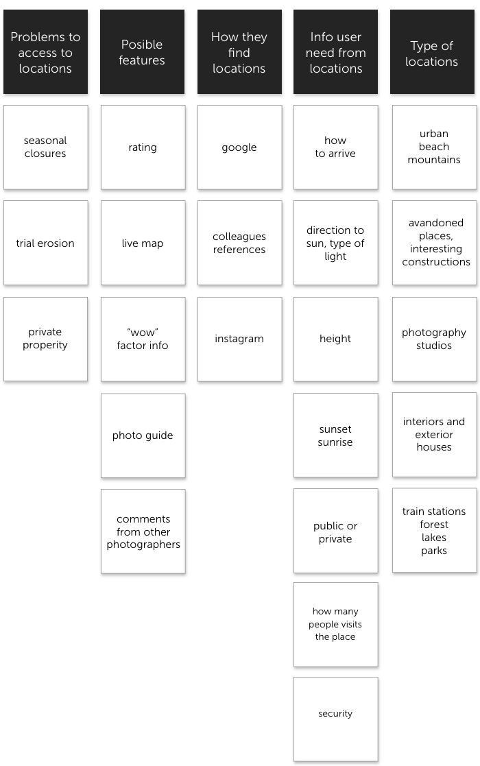
So from this part, i really understood how they search for places, and the problems they have to do it:
· Photographers usually go around a lot of random situations, like seasonal closures, trial erosion, sometimes they even have to cancel sessions because they don't have information related to know if the property is public or private. They don't know if they can access easily to provisions, or if they have to take special care because maybe the area is not so safe.
· From that first problem comes another, repetition. Like they don't want to be exposed, and they don't want to expose their clients to all this randoms situations, they start repeating a lot, and clients complain about that.
· Colleagues. You have to be always in touch with other photographers, sometimes they share new places, and that can be a good input.
· Google maps. They use a lot google maps, but again, the information is not enough.
Affinity Diagram
Step 2 : Ideation
With these findings and insights in mind, I dove deeper to learn more about my users by building personas, and a user journey.
User Persona

From the Persona research, i found that Santiago was going to be the perfect user for my app, because of the problems he is facing with his clients, related to the personalized service the clients are asking him for.
User Journey

From the User Journey i learned that is really important to have flexibility and a good number of options to offer to clients, every client is going to be different. We found that is going to be really important to search by map too, and a feature to permit the photographer to share the locations easily, and quickly.
Site Map

This was the first tentative site map, after iterations it changed to his final shape.
Lo Fi Wireframes

Making an early user testing with this low fi prototype, allowed me to further refine my app. With all the feedback i started detecting new pain points and things to improve. Afterwards, I move on to moodboard and hi-fi wireframing for final design.
Step 4: Design
After a long investigation about photography, download and browse different applications, from photographic editors to travel applications among others, to know the operation of maps and locations, and in turn give priority to the image, the most important for the photographer. I made some decisions, which I was then able to refine in a moodboard.
It decided to design a clean interface, with a lot of white, leaving photographs and information to be highlighted.
About color, i thought it was interesting to have blue, electric and energetic because of it's presence that usually has in photographs, in the sky, in the water
Moodboard

Hi-Fi Design

Demo
Outcome
Thanks to usability testing and feedback i found many improvements to make to our initial designs, and also plenty of additional features that could be developed in future iterations. Conducting early usability tests throughout the process gave me a final product that fitted seamlessly into the application and allowed users to find and add locations easily. This is only an MVP! There is a lot more to discover!
Now take a look to the video of the MVP presentation!

My design proposal for Scouting with which I won the UX/UI Design Hackshow at Ironhack, Barcelona
Thank you!